
The Hero in Animation
as a Marketing Strategy
In animation, the character, their appearance and design hold colossal significance. Cinema works differently. Leonardo DiCaprio sank in the Atlantic Ocean, played a survivor in the snow, engaged in stock market schemes. There are many DiCaprios, but Mickey Mouse is always one. This is what sets animation apart from cinema.
Creating a character like Mickey Mouse is not easy. But the effort is worth it, especially when we talk about Hollywood. In mainstream animation, perhaps the most crucial element is the merchandise created from animated characters.
Look at this. Mickey Mouse can be recognized simply by his ears. This is his main advantage from a marketing perspective.


Instant Recognition
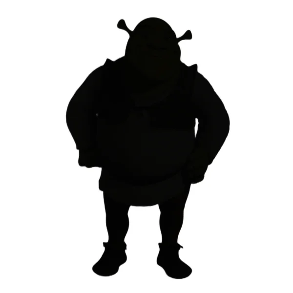
Let’s play a game. Take a look at the silhouettes of these animated characters.
Are there any you didn’t recognize?
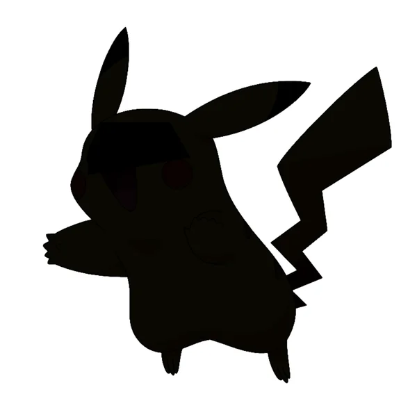

I’m sure you recognized almost all of them. At the very least, you thought “oh, it’s that one…” Why does this matter?
The first crucial aspect of creating a memorable character is form. Shape. Silhouette. It’s about making the audience recognize the character instantly. This is a basic rule of marketing. It’s how company logos work: they are designed to create an immediate association with the brand.
The same goes for characters. On t-shirts, mugs and stickers, the character appears in full — not just its head or eyes.
That’s why the character’s shape must a) be recognizable to the audience and b) not be overly complex. Unnecessary lines, angles and squiggles are removed, leaving only the essentials.
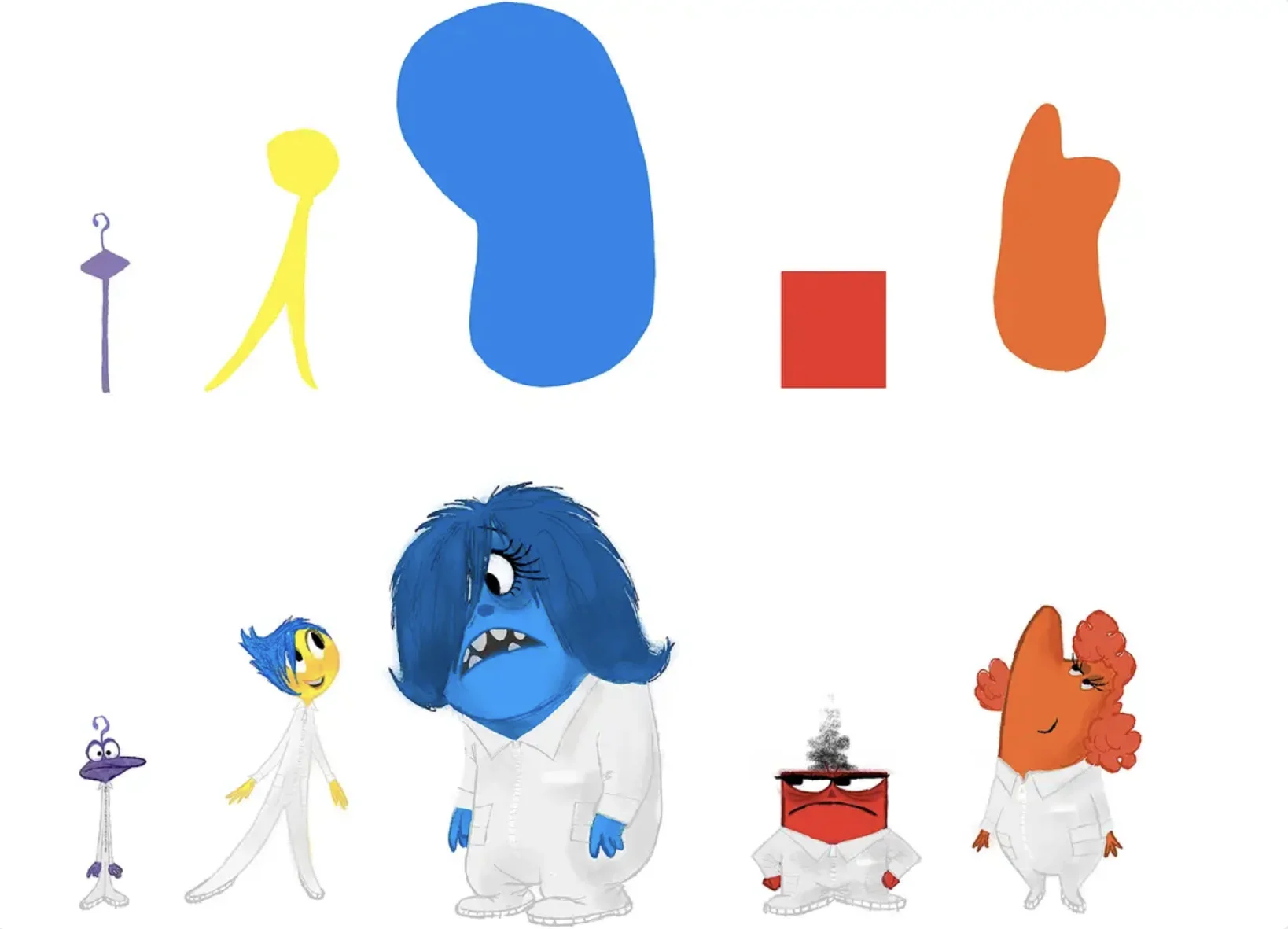
Take a look at how Pixar creates final versions of characters from initially simplified shapes.

It’s not an easy task. Creating a character takes tons of paper and sketches. Here is what the sketches for Pixar’s “Ratatouille” look like.
One Key Detail
Let’s look at some crucial techniques for creating a memorable character.
If you were asked what sets The Simpsons apart from other characters, you would likely give the same answer as I would: the yellow color.
That’s the main bright detail of The Simpsons. Their color. Not just yellow — it’s intense yellow. Yet it’s a yellow that is comfortable for the eyes. Not lemon yellow, not yellow-red. The kind that is pleasant to look at. See how The Simpsons would look with ordinary human skin.


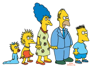
Now take a look at how The Simpsons looked in their original version. Back then, Simpsons creator Matt Groening made several short films with these characters. Before airing on TV, the characters were reworked and simplified. You’ll agree the simplified version looks much brighter and cleaner.
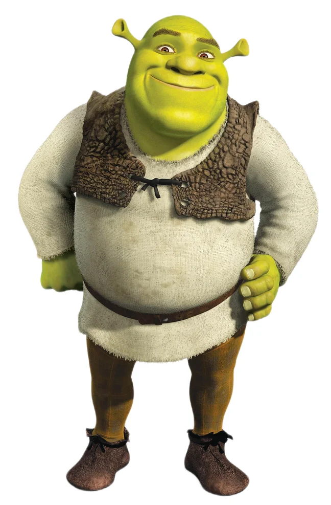
Another example of a character whose color plays a colossal role is Shrek. Ask anyone offhand “What sets Shrek apart from others?” and you’ll likely hear “He’s green,” or at least “He’s huge and green.” Green is a completely atypical skin color, unless it’s an animal.
It’s a rather unpleasant color to the eye, but the creators made sure Shrek didn’t look menacing: he is a bit goofy, generous, and the audience grows to love him very quickly.

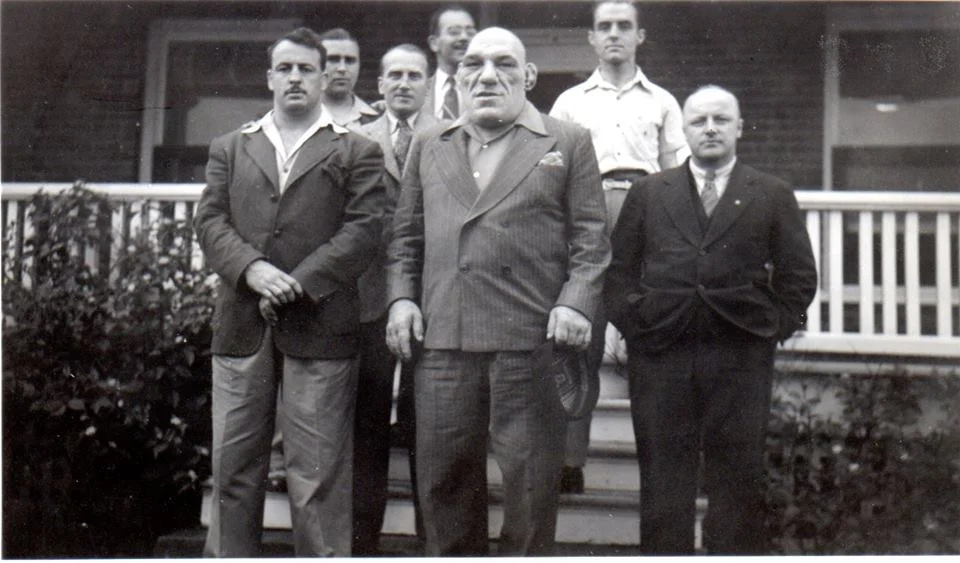
By the way, notice that characters that seem entirely invented quite often have real-life prototypes. Shrek’s prototype is the wrestler Maurice Tillet.
And one more example is SpongeBob. Even now it’s hard for me to imagine how the show’s creator, Stephen Hillenburg, dared to take such a step — inventing a character who is a sponge. It’s quite a bold idea, and putting it on the air was even bolder, but it was definitely worth it: the series became hugely popular. Still, let’s stress it once again. SpongeBob is not an animal, not a human, not an alien and not an ogre. He’s a sponge. An ordinary kitchen sponge.

Exaggeration
This is another fundamental technique in animation. It’s not always used, but it certainly makes a character much more vivid. Visual exaggeration works mostly with human characters, though not always. There’s no need to amplify SpongeBob’s look: the fact that he’s a sponge is already enough to grab the viewer’s attention. Let’s look at other characters.

This is Pixar’s “The Incredibles.” Notice the disproportionate bodies of almost all the characters. Small legs or a large head, tiny feet or unrealistically inflated shoulders. And, importantly, their proportions also work in relation to the other characters.

And this is a lesser-known character, yet one of the first vivid characters in the history of animation: Betty Boop. Look at how much her head is enlarged relative to her body. Generally, a large head is a technique for a “cute” character, slightly infantile, evoking childhood — precisely because such body proportions are typical of children. Perhaps this was done because the authors wanted to create a character with overt sexuality, but overly explicit sexuality was impossible in the 1930s. She had to be given purely cartoonish features.
However, this didn’t help much — for that time, such a character was so bold that the project was eventually shut down due to strict censorship.
Behavior
Take a look at this short video from Pixar, with just one scene from “Inside Out.”
Notice how differently the characters move. Joy, Sadness, Anger, Fear, Disgust. How differently each of them expresses their emotion. How their walk and body movement differ depending on how they are drawn. How heavy, square and clumsy Anger is, how nervous and rubbery Fear is. It’s all the result of work to make each character stand out from the others, so you can tell them apart not only by their appearance but also by how they behave.
Speech Characteristics
A character’s speech characteristics are just as important as their appearance. Think for a second of how Winnie the Pooh speaks in Yevgeny Leonov’s voice. Now recall the voice of the Wolf from “Well, Just You Wait!”. And now the voice of the jackdaw saying “It’s me, postman Pechkin, I brought a parcel for your boy.” I’m sure you remembered these voices down to the intonation and pauses.
That’s because voice matters enormously. Remember Masyanya’s laugh? It’s her signature, along with the shape of her head. Antagonists stretch words ironically or sarcastically, and their voices are often hoarse and low. However, main characters can also have a hoarse, low voice. Take Winnie the Pooh again: if we recall him, he’s not mean at all — abrupt, with pauses (to think), a man of few words, without ill intent.
Another example is Stewie from “Family Guy.” What can we say about him? A head shaped like a rugby ball and a low male voice. Here there are even two distinctive details, and, importantly, Stewie stands out from the other members of the Griffin family. This emphasizes his qualities.
In our studio, we always strive to invent engaging, vivid characters that viewers will remember. If you want a memorable animated video for your product, contact us
Character as Impression
While Mickey Mouse or Masyanya are complex characters with a whole range of feelings, sometimes it’s enough to create a character that conveys just one emotion to the viewer. This often works in social videos, short ads, and projects aimed at producing a specific effect.
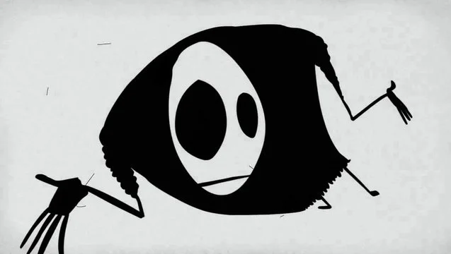
One example is Mr. Freeman, created by Pavel Muntyan’s studio. Remember him?
This creature has a negative charm and evokes rather unpleasant associations, but that doesn’t mean he isn’t interesting to watch.
Hayao Miyazaki works in a similar way. His world deserves a separate discussion, but today we will focus on the secondary characters, whom he manages to make absolutely magical and unlike anyone else.

Kaonashi, or “No-Face,” is known to almost everyone. The key thing the author does is create a vivid first impression. The character is mysterious, unexplored, unknown.
He unfolds differently in the films, but what matters more is the bewilderment he provokes at the very start. This is achieved not only through vague, hollow facial features (no pupils, no nose, no face as such — the face is actually a mask) but also through transparency in drawing the character. It’s a very bold technique that few animators and studios use. A transparent character is harder to work with, but Miyazaki can do that too.
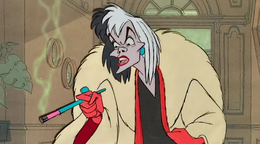
A single emotion carried by a character is the technique most often used for villains and antagonists. When the viewer doesn’t need to choose how to feel about the character because the artist has decided for them, the task becomes simpler.
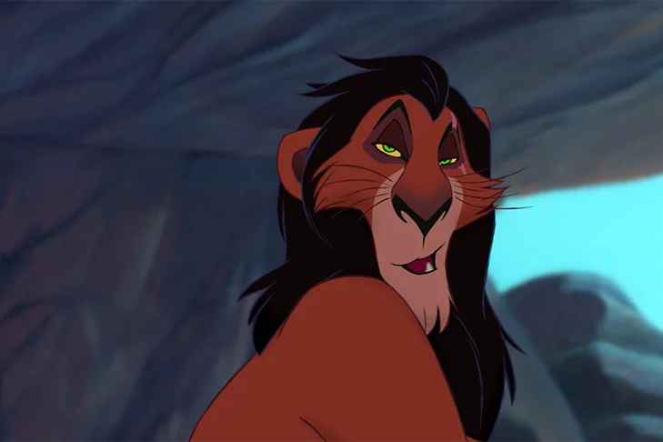
You can see the similarities among all the villains with the naked eye. Typically, they have dry, lean facial features, elongated chins and noses, and eyebrows drawn toward the nose. Even our own Shapoklyak has these features.


A Living Character
When animation aims to live a story with the character, to follow them and immerse in their experiences, it’s crucial to make the character alive. In puppet or cut-out animation this can be doubly hard. After all, characters are made of paper, felt, papier-mâché and who knows what else. How do these characters come alive?
If you haven’t seen “Tale of Tales,” watch it. This is the film’s main character, the little wolf. Here’s his story: an acquaintance of the film’s author, Yuri Norstein, found a newspaper with a photograph: a kitten with a stone tied around its neck had been pulled out of the water, alive. Someone had apparently tried to drown it.
The photographer took a picture, and Norstein could never forget the eyes he saw in that kitten. The same eyes were given to the little wolf, the hero of “Tale of Tales.”

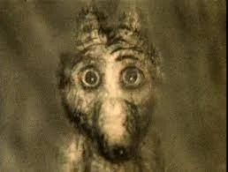
This is an example of how an author makes a character alive. How he brings a character of paper or clay to life so the viewer lives the story along with the hero.
Now look at how the eyes of Pixar’s robot WALL-E are made. I’m sure the eyes were the creators’ main focus, since they set themselves a seemingly impossible goal: to create a living robot. By the way, this is a basic technique in Pixar storytelling. To learn how animation scripts are written, read here
What makes WALL-E alive is undoubtedly his eyes. First, they are tilted toward each other, a basic technique for portraying a “kind and slightly self-sacrificing” hero. Second, they are expressive and huge, and evoke unconditional sympathy from the audience.

So, what we have learned from analyzing the hero in animation is that a good character has a simple, clear silhouette (not always and everywhere, but it still matters for a memorable character), unique speech characteristics, movements and facial expressions. It’s worth noting that even in Disney animation this doesn’t always hold — Disney princesses resemble each other more than they differ in behavior and mannerisms. It’s a familiar fact that, due to production complexity, many studios use templates for characters’ facial expressions and emotions. And the more unique the character, the more expensive it usually is to produce.
But the most important thing is to make the character alive. All these techniques help the viewer connect with the hero, but the talent of the creators plays a crucial role, and, of course, their unconditional love for their characters, even if they are villains.

Author: Sasha Potapova
CONTACTS
Write to us at the contacts below to discuss the project, or fill out the brief and we will contact you
@ Betooned 2026